14 day Return Policy (Sale & Promotion Goods 7 days)
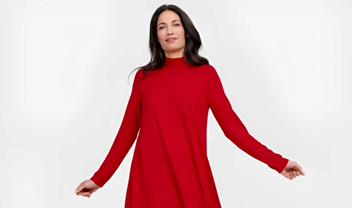
Tips on How to Style Your Outfit with Red
Are you looking for ways to experience more fashion-forward moments and stand out from the crowd? If your answer is yes, then red is a classic choice that never goes out of style.
Many people can be afraid of wearing this bright tone, but in this blog, we’ll explain just how versatile it really is, how it can be used as an accent to add some intrigue to an outfit, or how you can embrace full siren mode and make an impact.
We’ll look at the psychology of red in fashion and ways to incorporate it into different colour palettes – be that the expected, or even unexpected, pairings!
Popular among staff and customers at Brenda Muir, red should be on your radar this season!
The psychology of red in fashion
There’s no denying it; red is one of the most powerful colours in fashion.
When you think of the colour red, you think of romance, passion, desire and love. Just look at all the branding around Valentine’s Day thanks to red signalling sensuality and attraction. Interestingly, studies have shown that people wearing red are often rated as more attractive, probably due to the cognitive bias towards love and romance that we are programmed to think of from an early age.
Red is a stimulating colour that raises energy levels and is associated with action and assertiveness. It is a good colour to wear during an important day in the office, particularly when you want to feel empowered and confident.
This could be linked to the fact that red has long been associated with power, luxury and status. Back in the day, it was an expensive dye to produce, meaning only royalty and clergymen could afford it.
On the flip side, red is also widely known for its connotations with danger – think red stop signs, warning signs, etc. as it instantly grabs attention and stands out. This means you do need to be mindful when wearing red and introduce it tastefully.
What are some classical red clothing combinations?
Next up, we’ll shine a light on some classic colourways when it comes to pairing with red.
Red & navy blue
Red and navy blue is a timeless combination for a reason, thanks to red’s connotations of confidence and attraction as mentioned above, and navy’s calm and grounding energy. Both shades perfectly complement one another with red’s intensity softened by navy’s depth, while navy’s seriousness is enlivened by red’s vibrancy. The perfect pairing!
This colour combination is preppy and tied to ideas of timelessness and generational wealth, think Ralph Lauren and Tommy Hilfiger.
Red & white
As we know, red is bold and eye-catching, meanwhile white is all about purity, simplicity and calm, together they create a striking high contrast look that feels fresh and crisp. This is thanks to white reflecting all colours and acting like a blank canvas, allowing red to stand out and look sharp.
Quite possibly the bravest of the red colour pairings, the combination of red and black works because both tones amplify each other, with red looking even more vibrant against black, and black looking even more commanding against red. Think high-drama and high-confidence!
Thanks to black absorbing light, it creates a backdrop which allows red to really pop. A lot of sports cars use this technique to make them standout and connote feelings of luxury and elegance.
What are some neutral tones that complement red?
Now that we’ve looked at some classic red pairings, let’s find out which neutral tones work well with red.
Red & grey
A subtler classic than red with black, white or navy, but it goes well thanks to the balance between red’s vibrancy and grey’s neutral tones.
As grey is a desaturated colour, it doesn’t compete; instead, it complements anything it’s put alongside, allowing it to pair red down, leaving a polished impression.
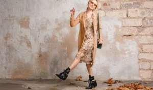
Red & beige
Another winner when it comes to combining red with a neutral tone is beige.
Beige is a warm neutral associated with comfort and understated elegance. It acts as a grounding backdrop that lets red shine in a warm and elegant way.
Bold colours that pair well with red
Let’s flip things on their head and look at some clashing colour combinations that involve red that are bound to make waves in the fashion world.
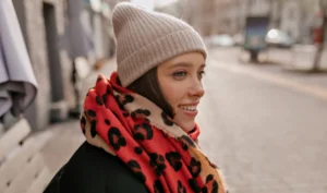
Red & pink
For a long time, red and pink were considered clashing colours, but over the years, there’s been a trend towards embracing them as a chic pairing.
Remember, pink is essentially a tint of red, meaning they belong to the same colour family, and when styled deliberately red and pink create a layered monochromatic effect. Think deep crimson with hot pink or cherry red with blush pink.
This colour combination evokes femininity and power for all who wear it. This is a high-fashion statement that feels modern, and of course, romantic.
Red & orange
Neighbours on the colour wheel, red and orange together can be a chic style choice, leaving an outfit feeling fiery and bold.
Thanks to being colours that sit beside one another on the colour wheel, this means they share similar undertones and create a gradient effect when paired together – nature loves to do this too; think sunsets, autumn leaves, a flame on a wick.
Red and orange together is a real power move with outfits radiating vitality, confidence and enthusiasm.
Red & yellow
Red and yellow are two of the three primary colours – perfect for colour blocking thanks to their natural harmony together. They both enjoy warm tones evoking heat, energy and brightness.
When worn together, you’ll be sporting a high contrast yet cohesive look that’s bound to leave a lasting impression.
Conclusion
We hope this blog has provided you with lots of styling inspiration for wearing red, and you feel empowered to start incorporating this vivacious colour into your wardrobe.
If you’d like to discuss where you might start, or if you’d like to take a look at our range of clothes and accessories, please don’t hesitate to visit us in-store at Brenda Muir.
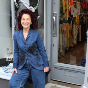
Marisa Davis
Marisa Davis, the owner of Brenda Muir, immerses herself in the world of fashion. She can often be found travelling the world, driven by a relentless passion to bring the ladies of Glasgow unique and quirky new designs.